Buttons and Cards | Enhancing Visual Focus Accessibility
July 13, 2023

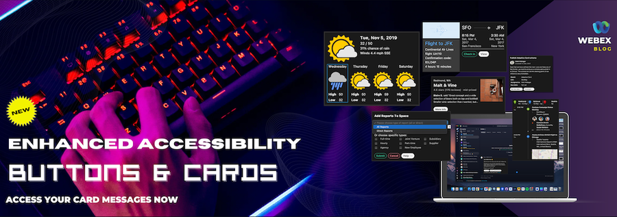
In today's digital age, accessibility is a key aspect of creating inclusive and user-friendly experiences. Buttons & Cards have become an integral part Webex messaging with Bots and Integrations. Buttons & Cards use Microsoft's Adaptive Cards specification to define the content of the card. However, the journey towards achieving seamless accessibility has not been without its challenges.

In this blog post, we will explore the improvement, earlier limitations faced by users when trying to use accessibility features within Buttons & Cards. We will delve into the issues surrounding Apple's automatic KeyView setup and the frequent frustrations experienced by users. But fear not! We will also unveil the exciting advancements we have made to overcome these challenges and provide users with a delightful accessibility experience.
Understanding the Struggles
In the past, Buttons & Cards users have met persistent challenges when trying to access key features related to accessibility. Three key pain points have surfaced consistently, hindering a seamless user experience:
- Hyperlink Text: Users have been unable to access link text within any Text View elements. This limitation has posed a significant obstacle for individuals relying on those looking to interact with link content.
- Select Actions in Containers: Users have faced difficulties in accessing actions within containers. This issue has held back their ability to engage with interactive containers element, restricting the full use of the desired functionality.
- Showcard View: Users have expressed frustration over the inability to navigate within the sub card view. The lack of focus within Sub cards has hindered their ability to explore and interact with content embedded within these nested components.
In macOS, major culprits behind this frustration have been the default setup of Apple's automatic KeyView, which has often failed to meet the necessary accessibility requirements, played a significant role. Users, developers, including ourselves, have seen how the default setup often does not meet the desired accessibility requirements, working with only some of visible card. Moreover, navigating inside and outside of a card in windows can sometimes be challenging, especially when the card itself has a focus ring when it's in focus within the messaging area.
Users have expressed their exasperation, noting that the focus rarely works as expected within the context of cards. That feedback has prompted us to dive deeper into the challenges faced by users and embark on a mission to revolutionize the accessibility experience.
Improved Focus Accessibility with Latest Updates
Recognizing the significance of addressing accessibility concerns, we have made significant strides in enhancing focus accessibility within Webex Cards. Our team has dedicated their efforts to finding solutions that surpass the limitations of Apple's automatic KeyView setup. In addition, Windows has made improvements in card inside-out navigating, ensuring that users can now benefit from improved accessibility features. Let's delve into the exciting enhancements we've implemented in macOS and Windows.
New Updates
Redesigned Focus Style
TextBlock,RichTextBlock: The user can now access internal actionable items such as hyperlinks and select an action.Input.Date,Input.Time: Focuses on the entire field so that the user can quickly figure out the focus component. Changes the focus of the clear action button as well.Input.Toggle: The checkbox button is immediately accessible to the user. If the text has hyperlinks or a select action, the user can navigate through the content.FactSet: The user can now access internal actionable items such as hyperlinks and select actions. The user can now focus on the title to value direction more easily.ChoiceSet: The radio or checkbox button is immediately accessible to the user. If the text has hyperlinks or select action items, the user can navigate through the content.
Hyperlink Text
- Users can now access link text in any Text View within Cards. This improvement ensures that user can easily interact with link content.
Select Actions in Containers
- The user can focus on actionable containers. select action supported in
Container,ColumnSet,Column, andImageobjects.
Showcard View Focus
- Users can now navigate and interact with elements within
Showcard.
Redesigned Error Message Display
- Error messages play a crucial role in guiding users when something goes wrong. With our new design, error messages in Cards are more visually prominent, ensuring they capture users' attention effectively.
Benefits and Impact
The impact of these enhancements is nothing short of remarkable. Users can now navigate at Buttons & Cards effortlessly, with focus accessibility working harmoniously with their interactions. Users can access the cards by pressing Ctrl + Space (macOS) or Enter (Windows), and then pressing Tab to navigate among internal elements. Pressing Esc returns from the Card.
We have seen a significant reduction in user frustration and an increase in overall satisfaction. By embracing a user-centric approach to accessibility, Webex Buttons & Cards have become more inclusive and welcoming to individuals with varying accessibility requirements.
Conclusion
In this blog post, we embarked on a quest to overcome the limitations of Apple's automatic KeyView setup, simplified the process of getting inside and going out of a card in the messaging area and revolutionize accessibility in Webex Buttons & Cards. We explored the struggles users faced when trying to use accessibility features within Buttons & Cards and shared their frustrations.
However, through our unwavering dedication, we have unveiled a new and improved accessibility in the framework that empowers users. The impact of these enhancements is profound, fostering inclusivity and ensuring a seamless accessibility experience for all. As we look to the future, we stay committed to pushing the boundaries of accessibility in Webex Buttons & Cards and actively exploring new possibilities to further enhance in the accessibility experience.
Need Some Help? We Got You Covered!
We are excited to provide you with support for these features. If you need help, the Webex Developer Support Team is standing by and happy to assist. You can also start or join a conversation on the Webex for Developers Community Forum.