Enhancing Agent Productivity by Creating Navigation Widgets in Webex Contact Center
March 12, 2024

Building on our blog series about the customization of Webex Contact Center widgets, we now turn our attention to the broad possibilities offered by navigation widgets. Unlike other widget types, navigation widgets provide developers with an entire page to customize, including its own unique URL path. This ability opens up a world of opportunities, allowing developers to integrate comprehensive views into external data sources, such as dashboards or databases, directly within the Webex Contact Center. Let's find out how you can harness the full potential of navigation widgets for an improved agent desktop experience.
You can find out more information about all of the different Webex Contact Center agent desktop widget types here.
Full Page Power
Navigation widgets are not confined to a small portion of the screen; they command an entire page. This expansive canvas enables developers to design more complex and rich interfaces, integrating full-scale applications right into the Webex Contact Center. Agents can access these applications without toggling between different browser tabs or systems, streamlining their workflow and increasing productivity.
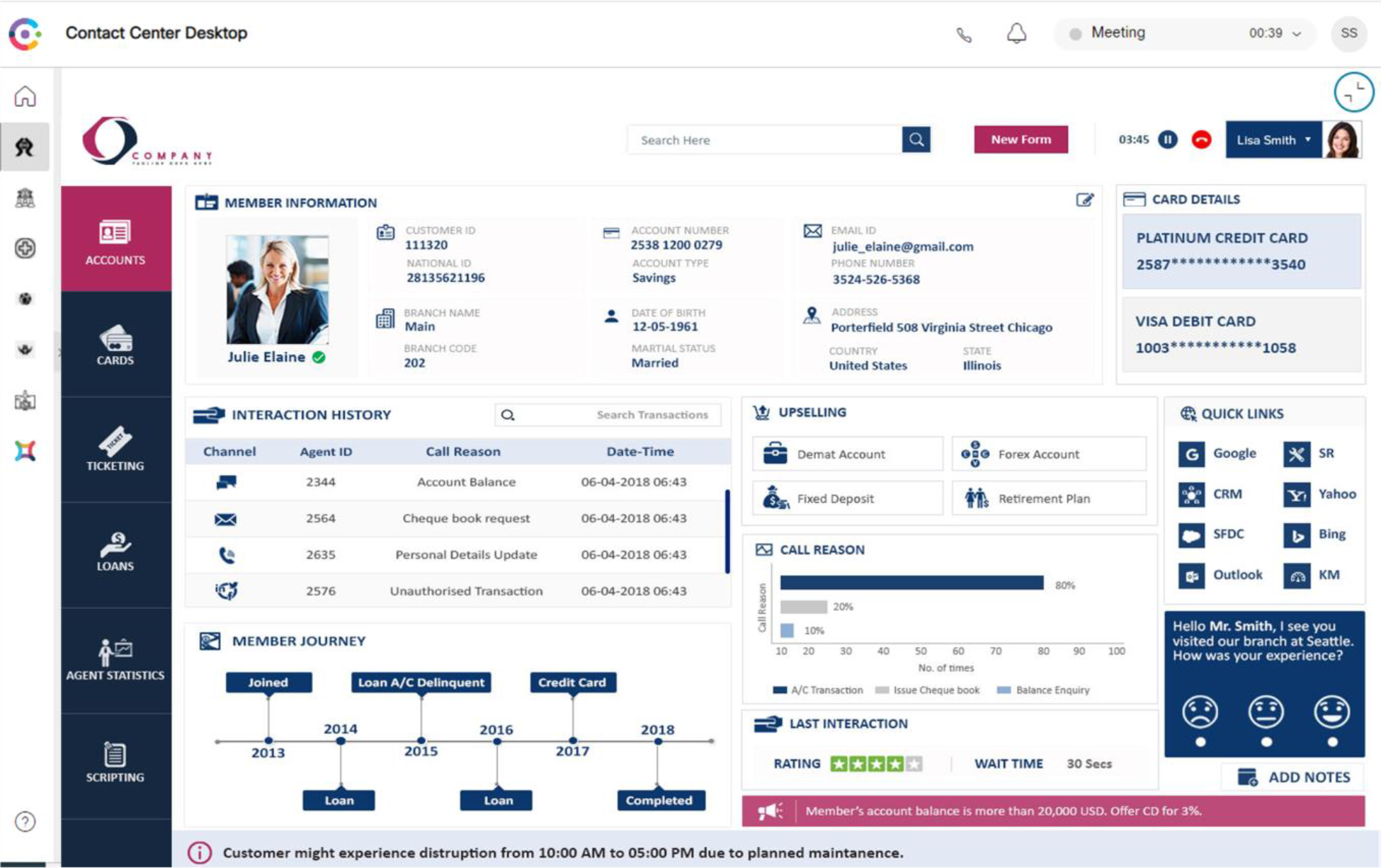
One of the standout features of Webex Contact Center is the ease with which agents can access various tools and applications needed for their daily tasks. Navigation widgets enhance this accessibility by adding customized tabs to the side main menu of the Webex Contact Center desktop. With just a click, agents can access the custom page without leaving the Contact Center environment.
 .
.
One example of proper utilization of these full-page navigation widgets is Agent Accelerator which is a uniquely integrated, unified agent desktop interface that empowers agents with a single pane of glass view by unifying information from multiple disparate systems including core-industry apps, backend systems, databases, CRMs, and more. The integrations fuel new efficiency among agents and enable faster resolution of queries without spending time on unnecessary screen toggling. Furthermore, having effortless access to complete customer information helps drive personalization and higher customer satisfaction.
Create Your Navigation Widget
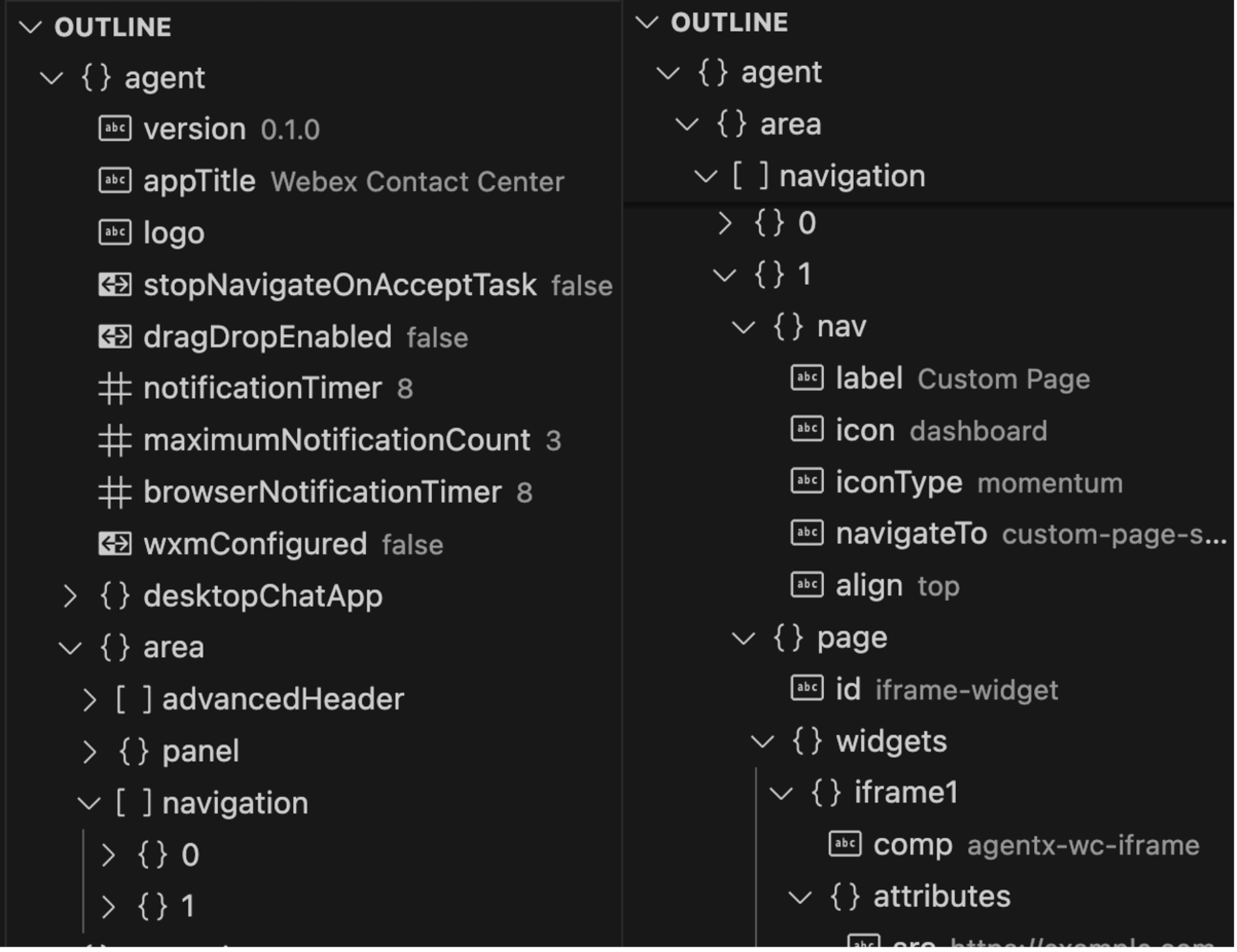
As mentioned in the previous blogs, Agent Desktop customization begins with editing the desktop layout file. If you're familiar with the layout.json file, you might recognize that it can appear quite complex at first glance. However, once you understand its structure, particularly the "agent" section outlined above, it becomes a powerful tool for customization. All the adjustments we'll be making should be nested within the "agent.area.navigation" array. For each Navigation Widget, there are two key property objects to consider: "nav" and "page." The "nav" object is where you define the widget's presence in the main menu, while the "page" object provides the space to fully flesh out the widget's page configuration.
Easy Navigation Access
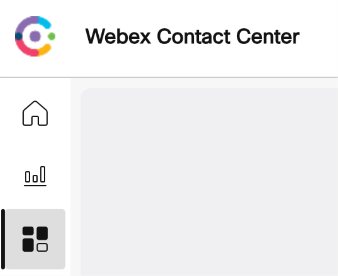
The custom tabs you add to the navigation bar aren't just gateways to information; they're also customizable elements that reflect your organization's branding and user interface preferences. You have the power to configure the icon, text, and URL for each navigation widget, providing a seamless and personalized experience for your agents.
For the icon, you can quickly customize it using Momentum Icons—a comprehensive icon library that's part of the Momentum Design System. These icons are optimized for Cisco's ecosystem and do not require an additional library to be loaded, thus maintaining your application's performance.
To incorporate Momentum Icons into your navigation widget, follow these simple steps:
- Visit the Momentum Design Icons page: Momentum Design Icons
- Browse and select an icon that best represents the function of your custom page.
- Use the icon's name in your
layout.jsonconfiguration for the navigation widget.
Here's a snippet of how you might configure a navigation widget with a Momentum icon:
"nav": {
    "label": "Custom Page",
    "icon": "dashboard",
    "iconType": "momentum",
    "navigateTo": "custom-page-sample",
    "align": "top"
}
In the above example, “dashboard” is the name of the Momentum icon chosen to represent a custom dashboard. You’ll also notice “custom-page-sample” is the value for “navigateTo”. This is the path to your custom page. So, if https://desktop.wxcc-us1.cisco.com is the location of your agent desktop, the path to your page will be https://desktop.wxcc-us1.cisco.com/custom-page-sample.
Grid Layout
Before we get into the specifics of layout.json for Webex Contact Center, let's touch on the underlying technology that makes these layouts possible—CSS Grid Layout. This CSS layout method is designed for the two-dimensional layout of items on a webpage, making it perfect for arranging elements into rows and columns. Some basic concepts that are utilized in Webex Contact Center include:
- Containers and Items: In CSS Grid, the parent element becomes a grid container with child elements as grid items.
- Columns and Rows: You can define the number and size of rows and columns in your grid.
Now, let's translate these CSS grid concepts into the realm of Webex Contact Center's layout.json configuration.
1x1 Grid Example
For a straightforward layout that focuses on a single task or view, a 1x1 grid is ideal. This layout showcases one widget in full view, making it the center of attention for the agent. In this example, we are loading a page in an iFrame which takes up the full view.
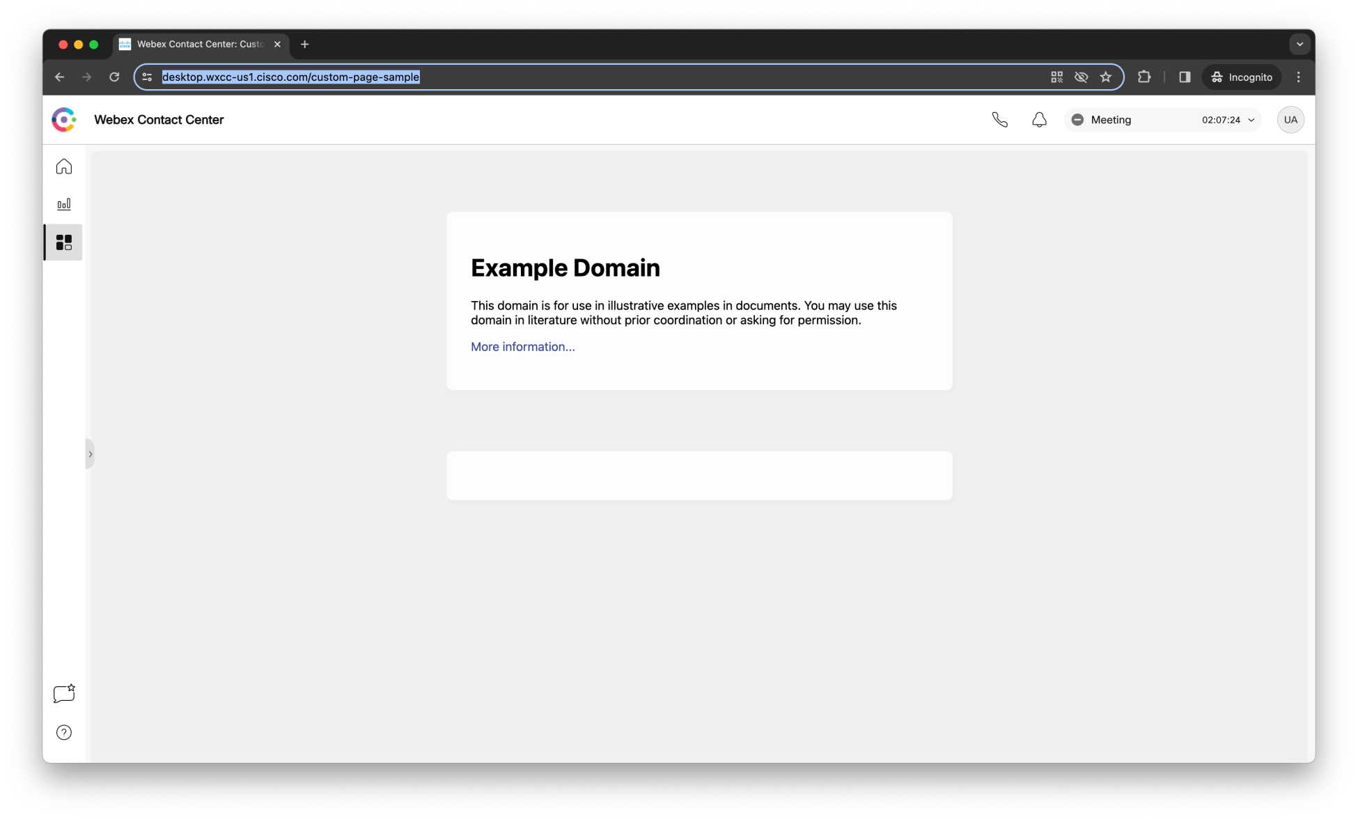
Here is the code that you can use to generate this page:
"page": {
    "id": "iframe-widget",
    "widgets": {
        "iframe1": {
        "comp": "agentx-wc-iframe",
        "attributes": {
            "src": "https://example.com"
        }
        }
    },
    "layout": {
        "areas": [["iframe1"]],
        "size": {
        "cols": [1],
        "rows": [1]
        }
    }
}
2x2 Grid Example
A slightly more complex layout, such as a 2x2 grid, can facilitate access to multiple tools and data sources simultaneously. In this example, we have 4 different iFrame widgets (all pointing to the same URL for brevity) being displayed on our custom page.
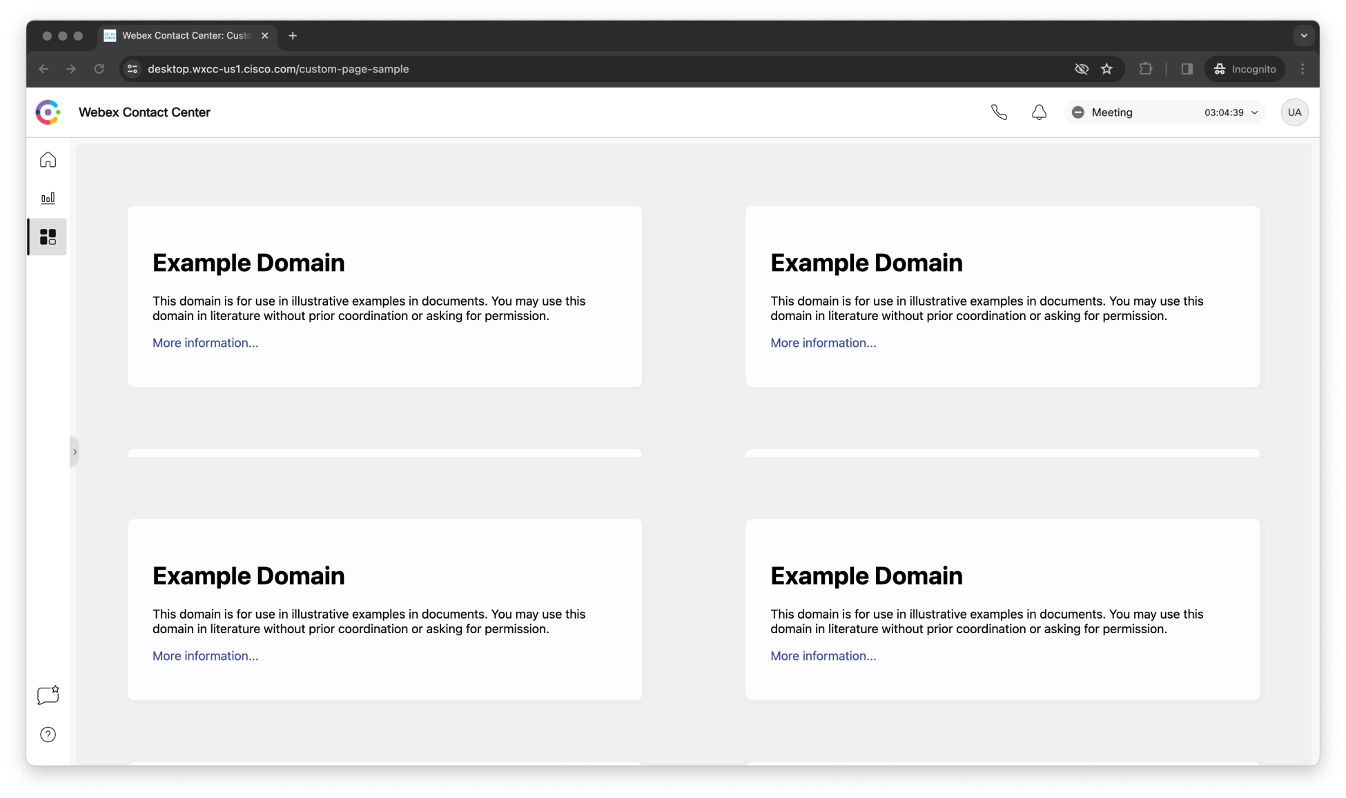
Here is the layout code that results in the above view:
"layout": {
    "areas": [
    ["iframe1", "iframe2"],
    ["iframe3", "iframe4"]
    ],
    "size": {
    "cols": [1,1],
    "rows": [1,1]
    }
}
Diving Deeper
These are just some basic examples to get you started with custom page layouts. Be sure to check out our Desktop Guide for more information on the Agent Desktop customization. For the full reference, visit the Webex Contact Center Setup and Administration Guide and search for the “layout” section.
Wrapping Up
Navigation widgets are a game-changer for developers looking to enhance the Webex Contact Center agent desktop. By providing a full page for customization and the ability to link to external data through unique URL paths, they open up new possibilities for creating an immersive and efficient workspace. Whether you're embedding complex dashboards or displaying critical data interfaces from external systems that your agents can interact with, navigation widgets empower you to bring everything together in a cohesive and accessible manner.
Stay tuned for our next entry in this series, where we will continue to explore the vast customization options available in Webex Contact Center. In the meantime, we encourage you to experiment with the layout.json file and witness the transformative impact of navigation widgets on your Contact Center operations.
For further guidance and inspiration, remember to visit the Webex Contact Center for Developers Portal and join the conversation with our vibrant developer community. Let's build a seamless and powerful agent experience, together.

